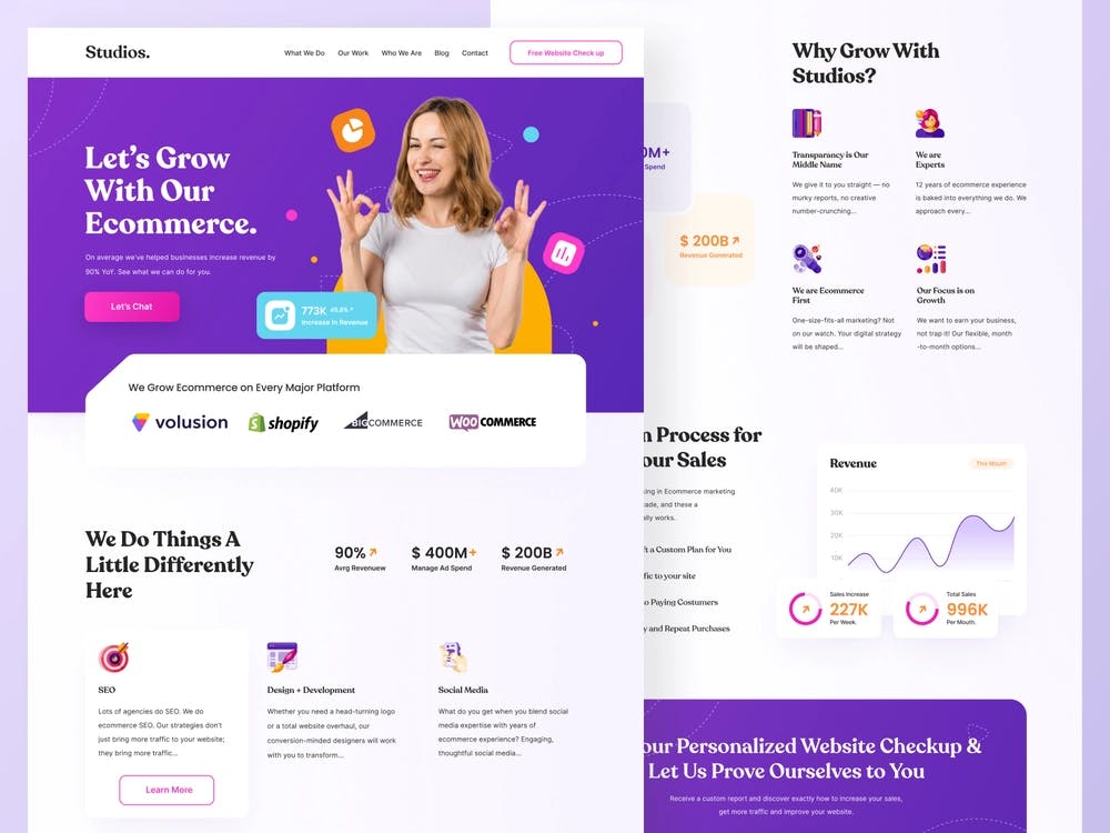
How to Choose the Right Colours for Your Website: Colour Psychology in Web Design
Introduction
The colours you choose for your website have a big impact on how visitors perceive your brand and engage with your content. Understanding how various colours can affect emotions and behaviour will help you choose the best colour scheme for your website. The psychology of colour is a complex subject that has been studied for years. In this piece, we'll go through the fundamentals of colour psychology and I will offer advice on how to pick the best shades for your website.
Colour psychology
Colour psychology is the study of how colours influence human behaviour and emotions, understanding how different colours affect people can help you design websites that appeal to your target audience. Here are some common associations with different colours:
Red: red is a colour that can be used to convey strong emotions or draw attention to a product.

Orange: orange is a warm and energetic colour that conveys a message of creativity and enthusiasm.

Green: green is a refreshing colour that can be associated with nature and health.

Blue: blue is a colour that evokes trust and professionalism.

Purple: purple is a creative and luxurious colour and conveys a feeling of stability and arrogance.

Choosing the right colours
When choosing colours for your website, it is important to consider your audience and how you want your brand to be perceived. here are some tips to help you choose the right colours.
The personality of your brand: Consider the principles and character qualities you wish to impart to your audience. Are you a confident, vivacious brand or a composed opulent one? Your brand's personality should be reflected in the colours you use.
Don't misuse colours: A content's focus may be detracted by an excessive number of colours which can be a huge obstacle to your product.
Test your colour scheme: Before releasing your website, check to see if the colour scheme elicits the feelings you were going for and is simple to use.
Use contrast: to make your material easy to read. Make sure your colour scheme has enough contrast. Users with vision difficulties can also benefit from strong colour contrast between the backdrop and text.
Colour combination
when choosing the right colour combinations you need at least two types of colours in your colour palette the main colour and the Grey colour. with experience, you can begin to add more colours (accents) to your designs. the accent must have a relationship with the main colour and the grey colour.
Note:
For diversity create lighter and darker versions of colours (tints and shades) in your design.
Use colours to draw attention to the most important elements of your website.
Don't use random CSS colours for designs.
here are some sites you can get good colours
Conclusion
Colour psychology is a powerful tool that can help you create designs that resonate and evokes the kind of emotions and reactions you want from your audience. By understanding the emotions that different colours can evoke, you can choose schemes that reflect your brand adequately.
I've always loved to create but one of the aspects of design i found quite complex was colours, I struggled to know how and when to use them. so I took out time to study everything about colours in design, although these are just basic concepts but I hope they help you.
